
Don's Auto Towing Website Redesign
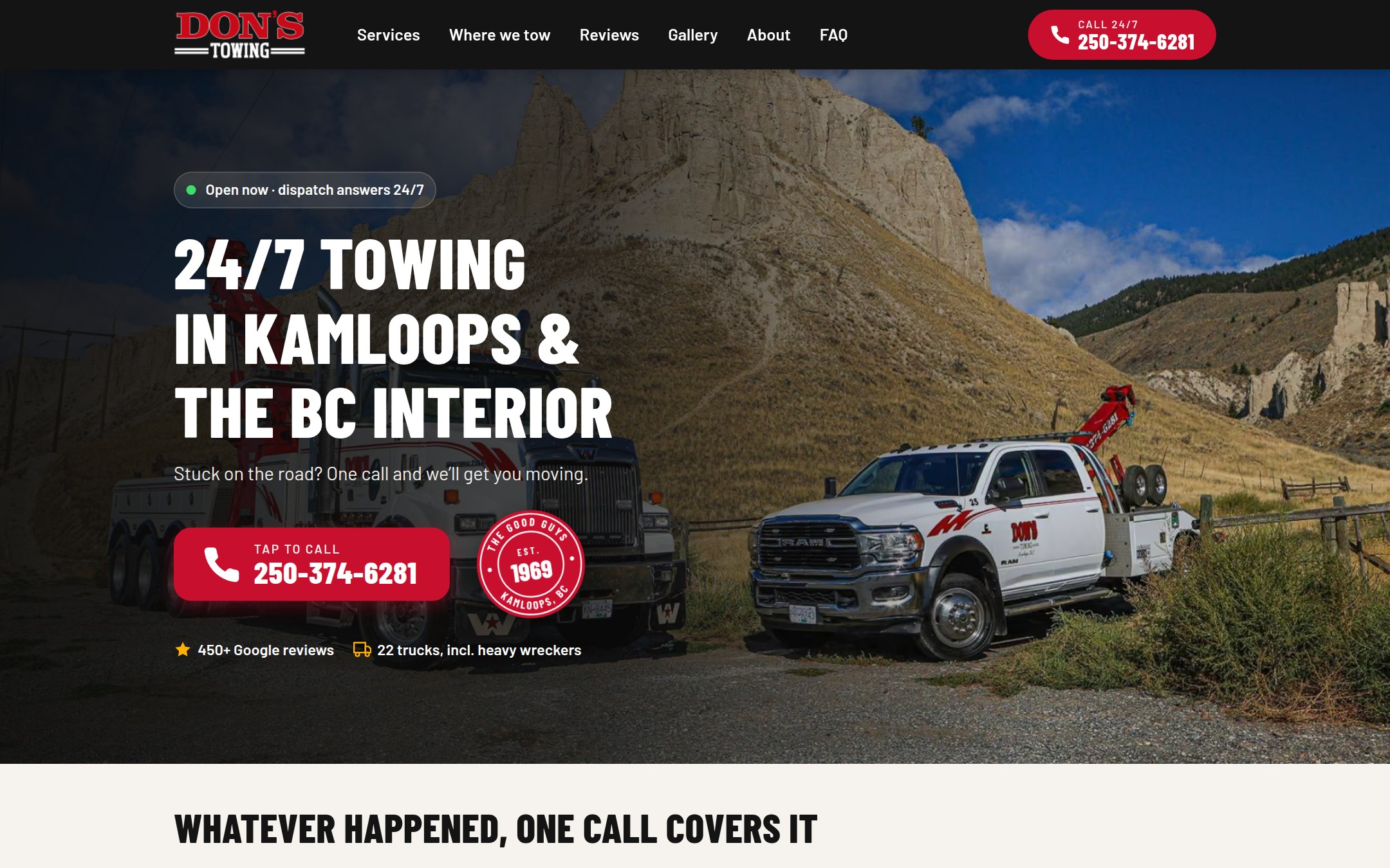
Don's Auto Towing has served Kamloops since 1969, and most people find their website on a phone, on the side of the road, on the worst day of their year. I audited their existing site and designed a phone-first concept built around one goal: getting a stranded driver to tap "call" as fast as possible.
The redesign keeps the phone number one tap away on every screen and loads about four times faster on a mobile connection. It adds local pages for 18 BC Interior towns, a filterable fleet gallery and a plain-language privacy page.
And because I'm an animator at heart, a little Don's tow truck drives across the bottom of the screen as you scroll.
- Role
- Website audit, UX and visual design, creative and animation direction
- Built with
- Claude Code (an AI coding partner), HTML, CSS and JavaScript
- Tested with
- Google Lighthouse and real phones
- When
- Fall 2026 · a concept, shared with permission
The challenge
Nobody visits a towing company’s website for fun. People land there on the side of the highway, on a phone, often with one bar of signal and their hazard lights on.
Don’s already ranked well on Google, so my goal wasn’t to reinvent their brand. It was to make the phone number impossible to miss, make the site fast on a weak signal, and speak to the stranded driver first.
What I found
Before designing anything, I audited the existing site on a phone and with Google’s Lighthouse testing tool. The bones were good: solid search basics, 450+ Google reviews and great photography of their own trucks. But a few things were costing calls:
- Once you scrolled, the phone number disappeared from view.
- On a mobile connection, the main photo took 9.2 seconds to appear. Google’s target is under 2.5.
- The first screen talked about “Western Canada” and fleet services, not Kamloops and the driver who needs help right now.
- The gallery downloaded almost 10 MB on a phone, and the 18 town pages were nearly identical, so they weren’t pulling their weight in local search.
I wrote it all up as a plain-language audit for the owner, with a list of quick wins. The full audit is available on request.
Designing for the side of the road
A call button that never leaves
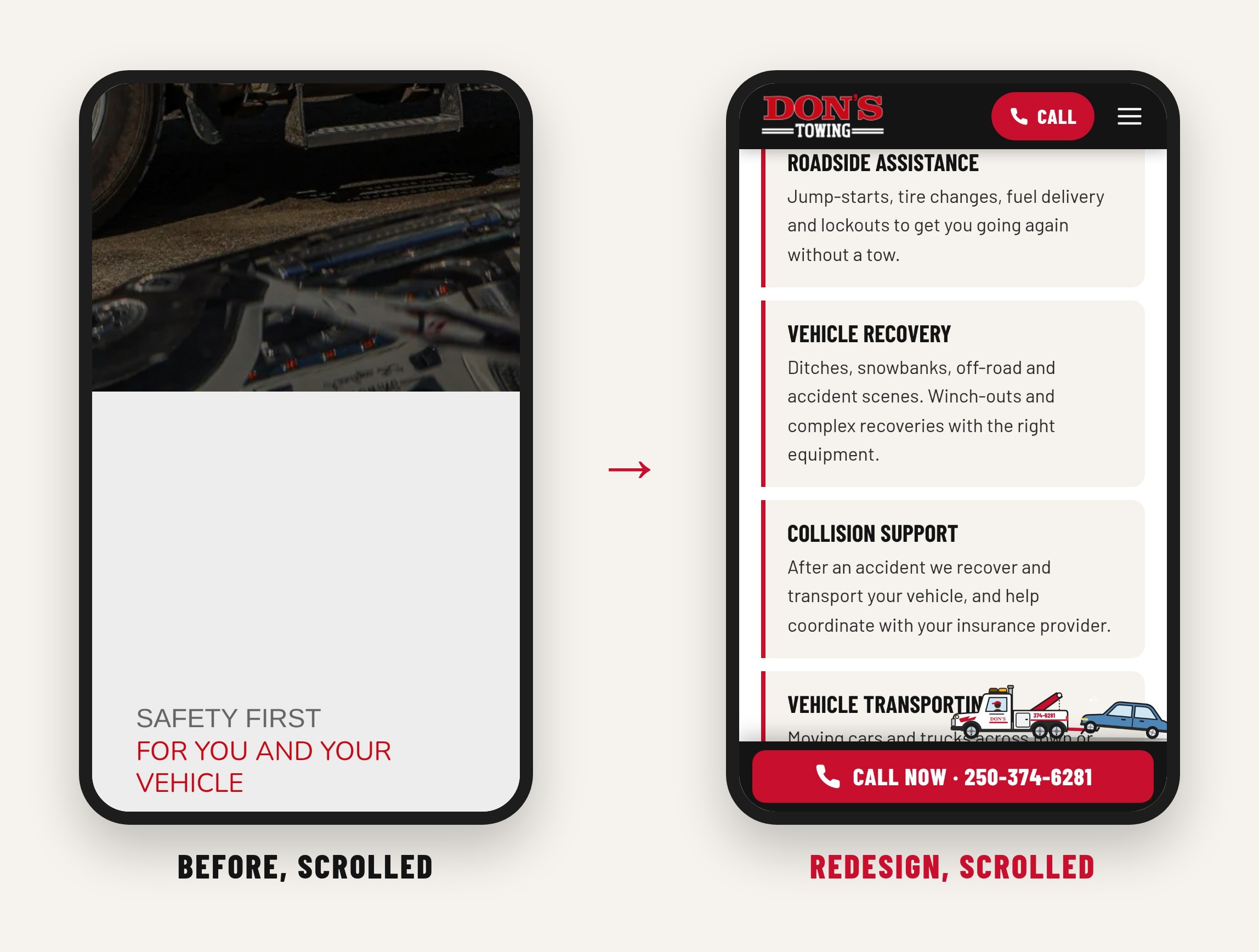
The phone number lives in the top bar on every page, and a big red “Call now” bar rises from the bottom of the screen as soon as you scroll past the first one, right where your thumb already is.
Three answers in three seconds
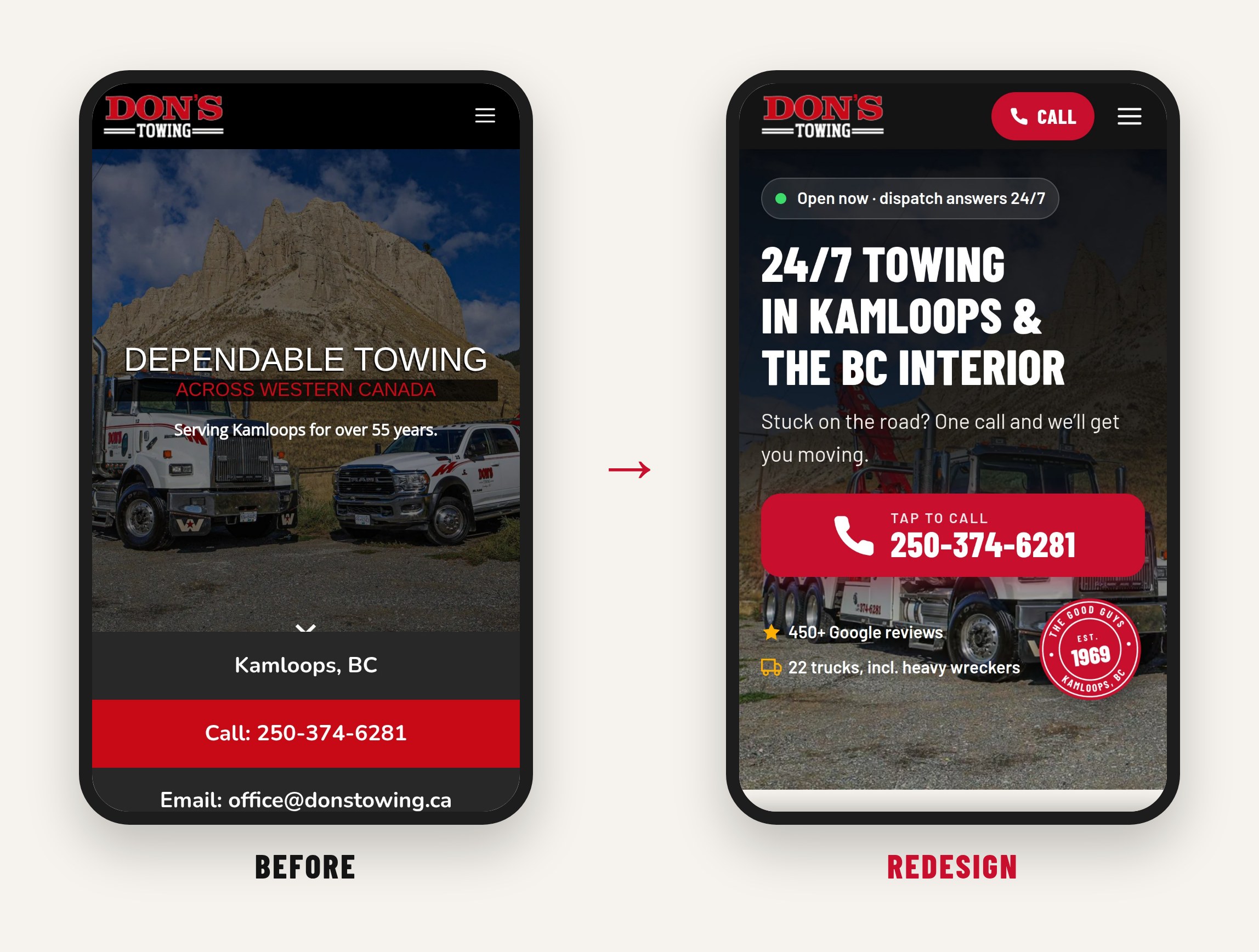
A stranded driver needs to know: do you tow where I am, are you open right now, and how do I reach you? The new first screen answers all three, with “24/7 Towing in Kamloops & the BC Interior”, a green “Open now” signal and one giant tap-to-call button.
Help while you wait
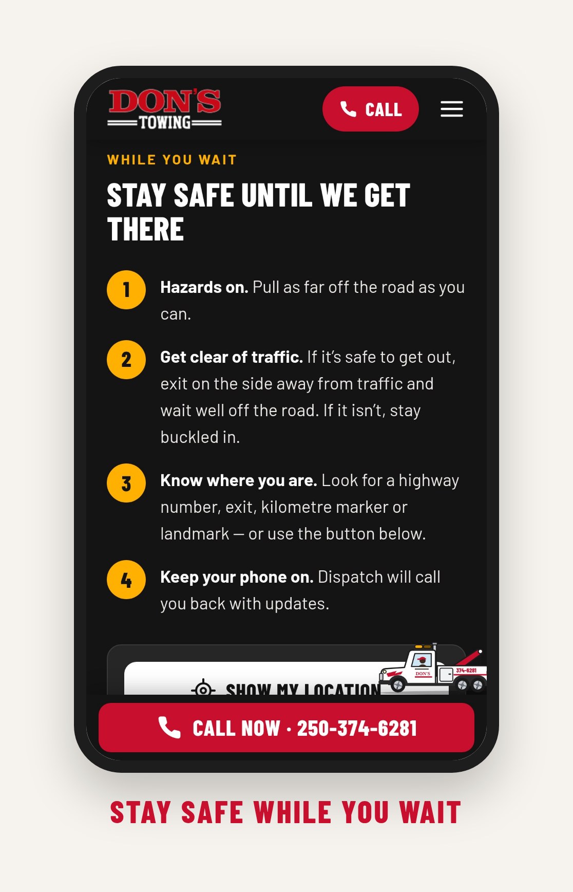
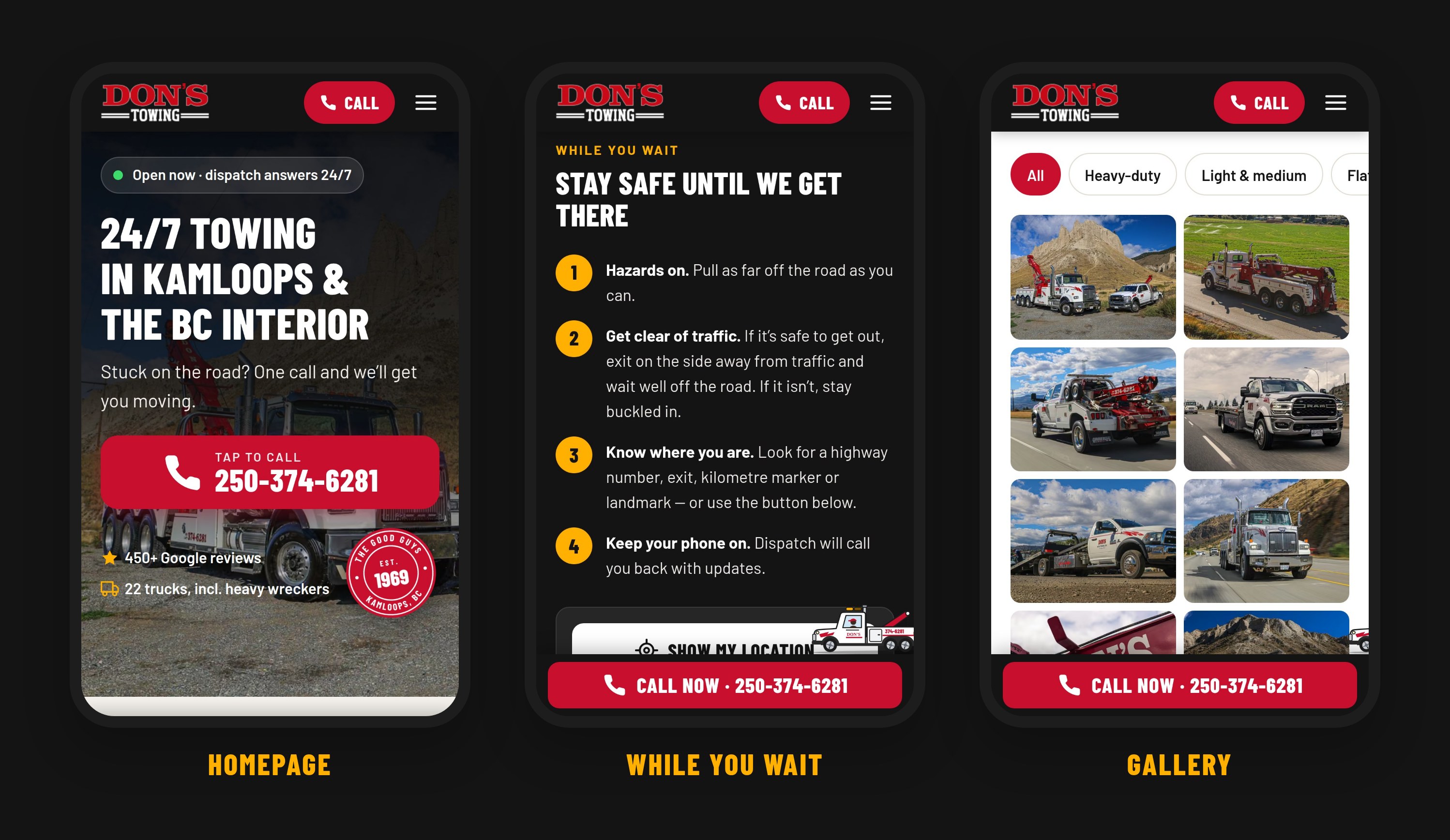
Eight “whatever happened” tiles (dead battery, stuck in a ditch, accident and more) show at a glance that Don’s handles your problem. Below them sit four calm safety steps and a Show my location button that reads your phone’s GPS, so you can tell dispatch exactly where you are. Nothing is sent anywhere.
Local pages that are actually local
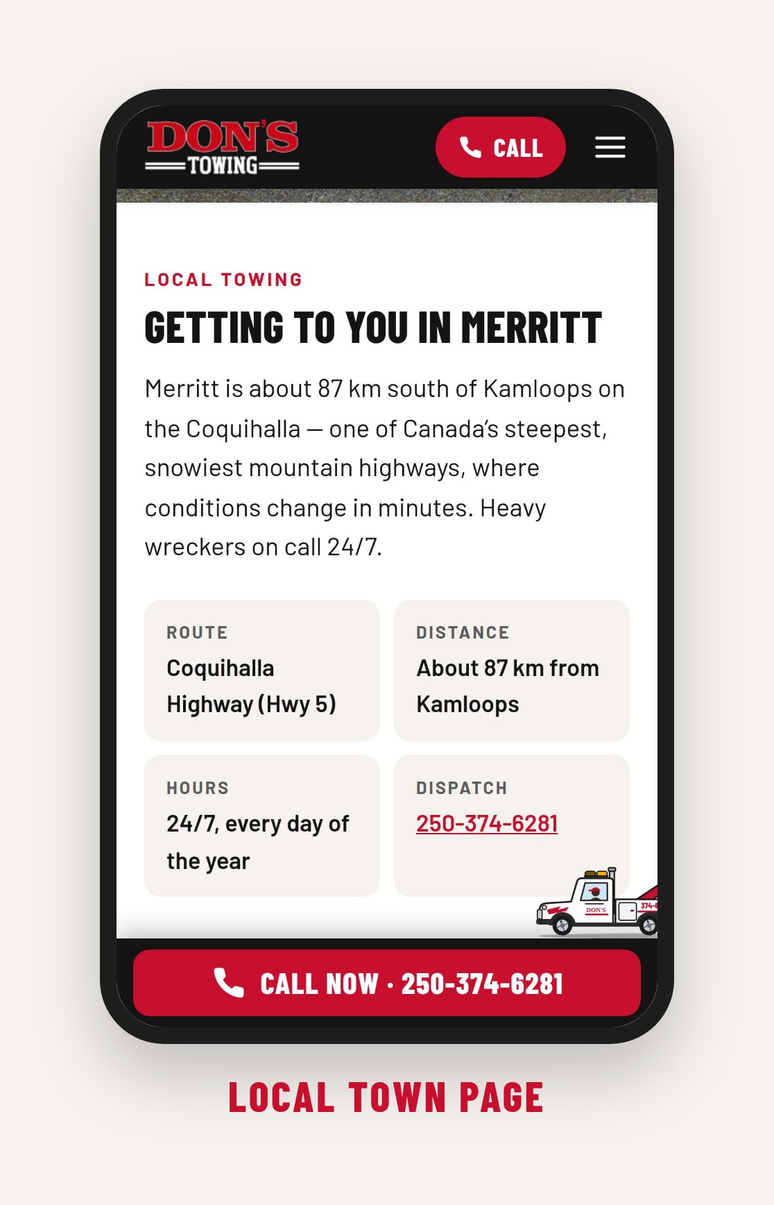
Each of the 18 town pages got its own details: the highway it’s on, the distance from the Kamloops yard and what driving there is like, from the Coquihalla to the Cariboo. That gives each page a real reason to show up when someone searches from that town.
A gallery worth scrolling
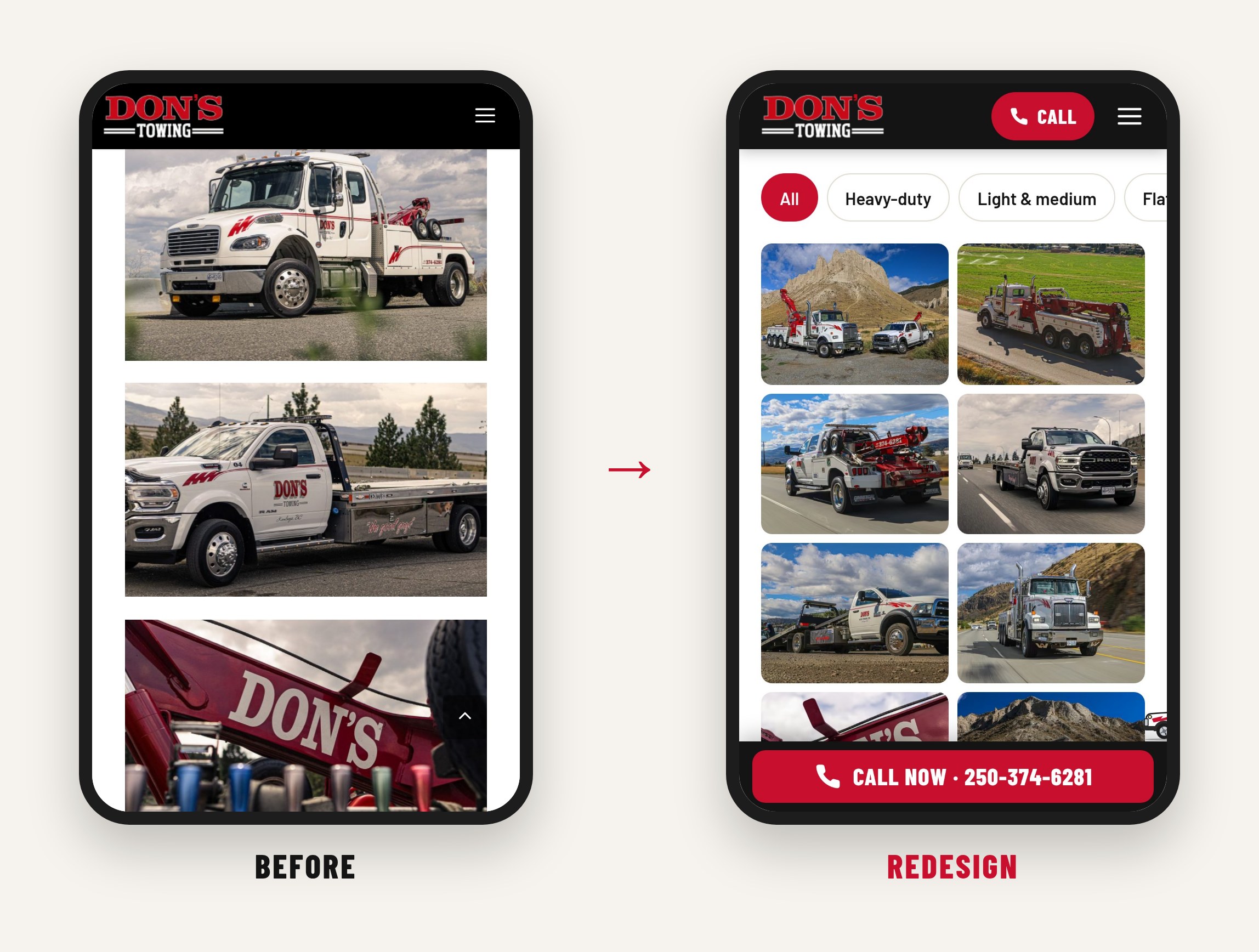
All 61 fleet photos now sit in a compact grid with filters by truck type and a full-screen viewer you can swipe through. Photos load just before you reach them, so browsing the whole gallery uses 1.4 MB instead of 9.6 MB.
The good guys since 1969
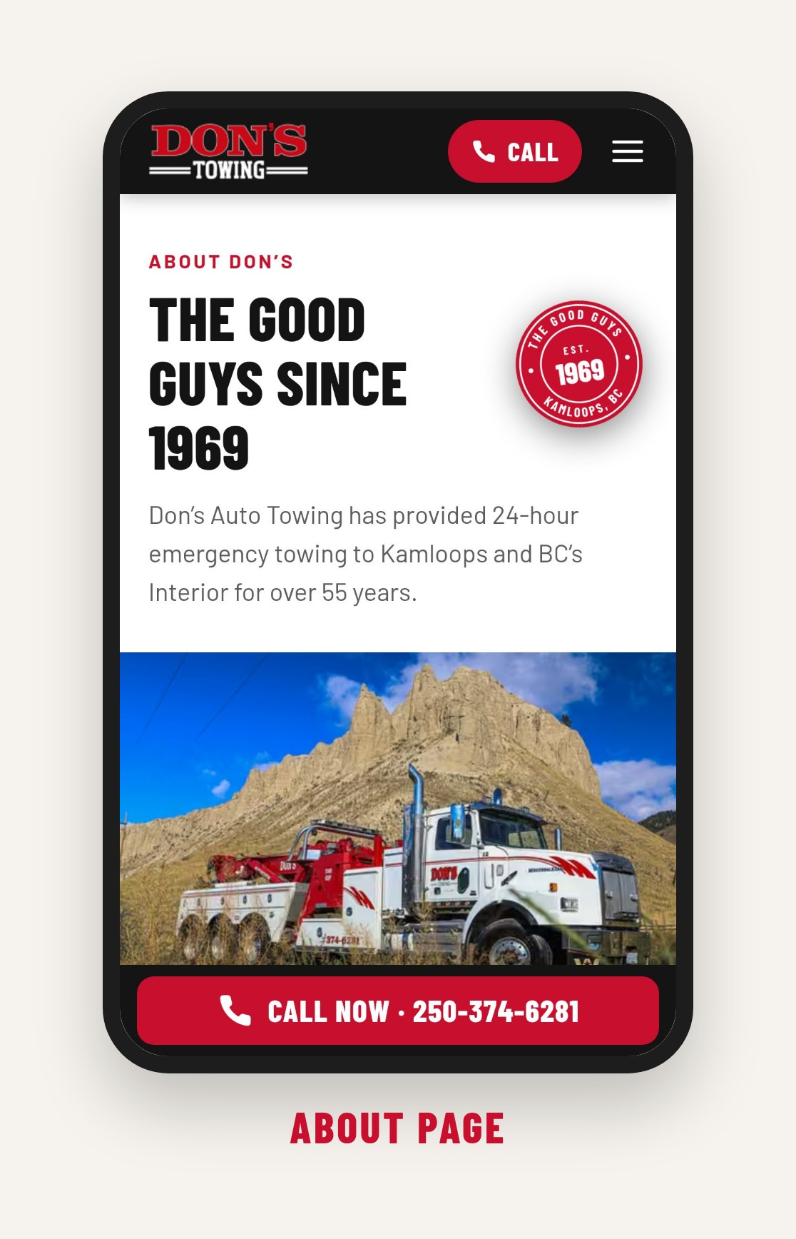
Don’s trucks carry “the good guys” in script, and they’ve served Kamloops since 1969. I turned that history into a vintage-style “Est. 1969” badge, and gave the About page a real story: the fleet, from flatbeds to a 40-ton rotator, who they work with, and the team customers thank by name.
Honest by design
Reviews load live from Google’s official service instead of being copied and pasted, so if a customer edits or removes their review, the site follows. The privacy page is rewritten in plain language and describes what the site really does: no cookies and no tracking.
The tow truck
As an animator, I couldn’t build a towing website without a tow truck. A little Don’s truck, car in tow, drives along the bottom of the screen as you scroll. It enters stage right and exits stage left by the time you reach the bottom.
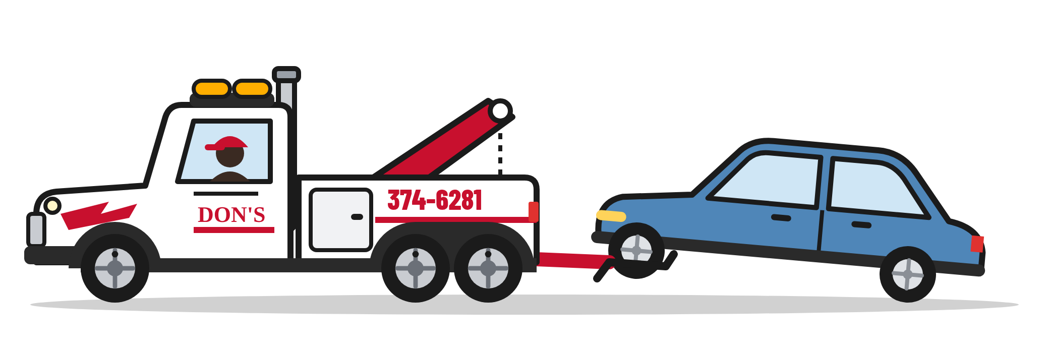
The scrollbar works like a timeline scrubber, and the motion uses the same thinking as keyframing in After Effects:
- Weight. The truck eases toward the scroll position instead of snapping to it, so it feels heavy.
- Anticipation and follow-through. It squats as it pulls away and dips its nose when it brakes, with a little wobble when it stops.
- Wheels that really roll. Each wheel turns by exactly the distance travelled, while the towed car’s lifted front wheels stay still.
- Little details. Amber roof lights flash, exhaust puffs float up, and a reverse light comes on when you scroll back up.
It never covers a button, and it stays put for people who’ve asked their phone to reduce motion.
Results
Measured with Google Lighthouse on a simulated 4G phone connection, September 2026.
| Measure | Before | Redesign |
|---|---|---|
| Main image appears | 9.2 s | 2.1 s |
| First text appears | 3.9 s | 1.2 s |
| Download to open the page | 1.4 MB | 250 KB |
| Performance score | 60 | 99 |
| Accessibility score | 92 | 100 |
| Best-practices score | 96 | 100 |
| Measure | Before | Redesign |
|---|---|---|
| Main image appears | 6.4 s | 1.9 s |
| First text appears | 1.5 s | 1.3 s |
| Download to open the page | 2.1 MB | 222 KB |
| Download to scroll all 61 photos | 9.6 MB | 1.4 MB |
| Performance score | 77 | 99 |
| Accessibility score | 92 | 100 |
Refining it
I tested on real phones, including with large text turned on, and refined the design in rounds:
- The truck. On phones, where the page is much longer, I tried having it make several laps. It felt busy, so one clean crossing won.
- The situation tiles. Re-laid out so they line up on phones with large text, and made compact on laptops.
- The phone menu. Closes as soon as you choose something, and never hides behind the call bar.
- The 1969 badge. Moved beside the call button on laptops, where it reads like a seal of trust.
- Reviews. Switched from hand-picked quotes to live Google reviews, so they can never go out of date.
How it ended
By the time I sent the redesign over, Don’s had already signed with another company a few days earlier. Timing is everything! The owner kindly gave me permission to share the work here, and I’m proud of it: a site that’s about four times faster on a phone, keeps the phone number one tap away, and has a little personality rolling along the bottom.
Next time, I’ll reach out with a short audit first and ask about timelines before building the full redesign.
Photography, logo and brand: Don’s Auto Towing Ltd, used with permission. This is a concept and isn’t Don’s official website; visit donstowing.ca for the real thing.