
Tracer Transport: Logo, Illustration & Website
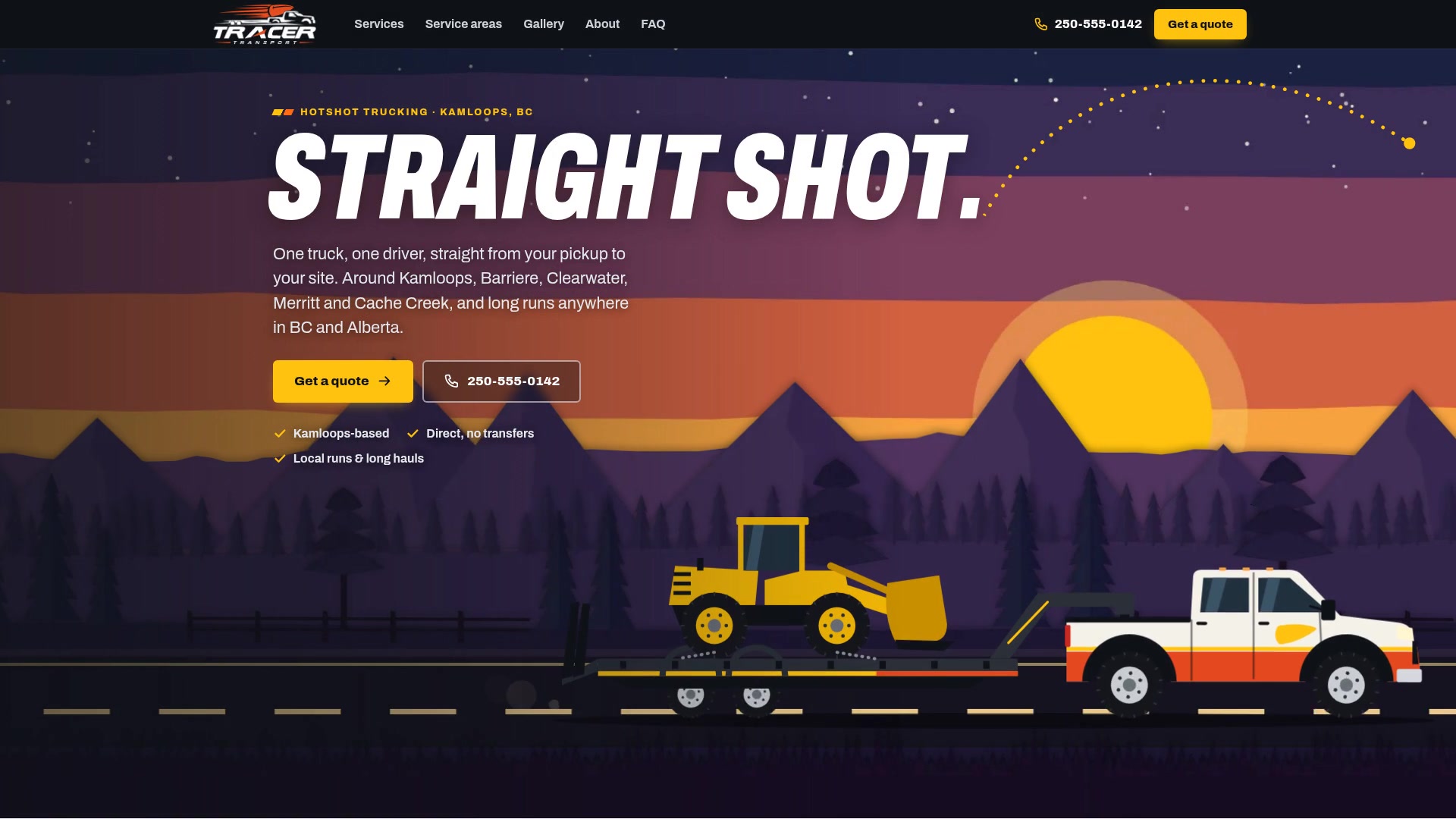
Tracer Transport is a hotshot trucking company that doesn’t exist, with a website that really works. I created it as a concept: a vector logo, an illustrated world and a full site for a Kamloops hauler that wants to be the first name you find in every small town it serves.
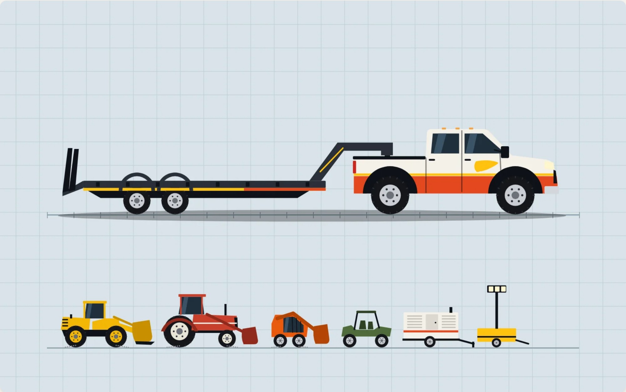
With no photos to work from, I treated it like a production: one truck on a model sheet, a kit of loads, and 14 cut-paper BC landscapes. The homepage opens on a multiplane shot, six layers of paper sliding at their own speeds with the rig rolling through them.
Behind it sits an admin the owner could run without a developer: quote requests, pages for 38 towns, and four levels of team access, right down to a driver uploading job photos from the road.
- Role
- Brand and logo design, UX and visual design, art and animation direction
- Built with
- Claude Code (an AI coding partner), PHP, HTML, CSS and JavaScript
- Tested with
- Google Lighthouse and automated browser tests at phone and laptop sizes
- When
- Fall 2026 · a concept
The brief
A hotshot is a heavy-duty pickup and a flat-deck trailer that takes one customer’s load straight from A to B. It’s often a one-truck business, and it lives or dies on being the name that comes up when someone in a small town needs something moved today.
So I gave this site three jobs:
- Be found in every town it serves, not only in the city it’s based in.
- Run without a developer. The owner and team change pages, towns and pictures themselves, each with the right level of access.
- Look like it belongs on the side of a truck, without a single photo to work from.
Tracer Transport is fictional: the name, the story and the phone number are all invented. The towns, highways and distances are real, so the site could show how it would really work.
A name you can see all the way to the target
A tracer is the round you can watch all the way to where it’s going. That’s the promise of a hotshot: one load, one truck, straight there, and you know where it is the whole way. It also handed me a visual language: a bullet, its streaks, and a dotted trajectory that runs through the whole site.

One truck, one bullet, straight there
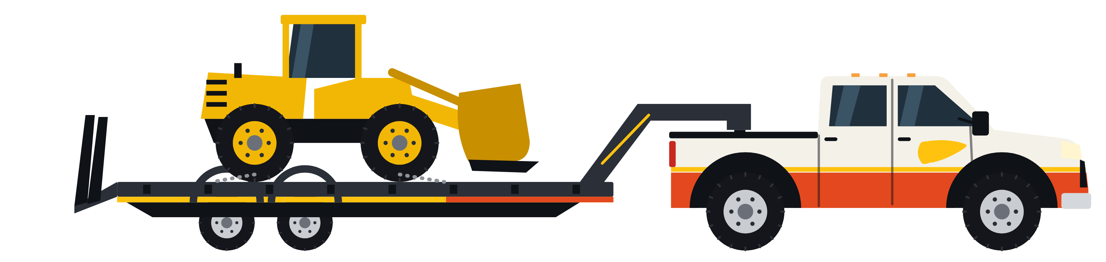
What a hotshot actually is, in one picture. Black and one orange, so it holds up on a white invoice, a black truck door, a hi-vis vest or a phone screen.
I drew it as vector paths instead of pixels, so it stays sharp from a browser tab to a billboard. Every piece is also its own shape, which means it can be animated like layers in an After Effects comp: the rig rolls in, the bullet fires, the streaks draw on, and the letters land. It plays in the site’s header when you arrive.

No photos? Draw the whole world.
A trucking website usually leans on photography, but a company that doesn’t exist has no trucks to photograph. So I treated it like a production: one model sheet, a kit of loads, and cut-paper backgrounds.
From that kit came 14 postcards, each set somewhere the company would really drive: the waterfalls up toward Wells Gray, hay country around Barriere, the dry canyons at Cache Creek, the Coquihalla at 2am. Each one is drawn in code with Claude Code under my art direction, so a change to the truck’s stripe carries through every scene at once.
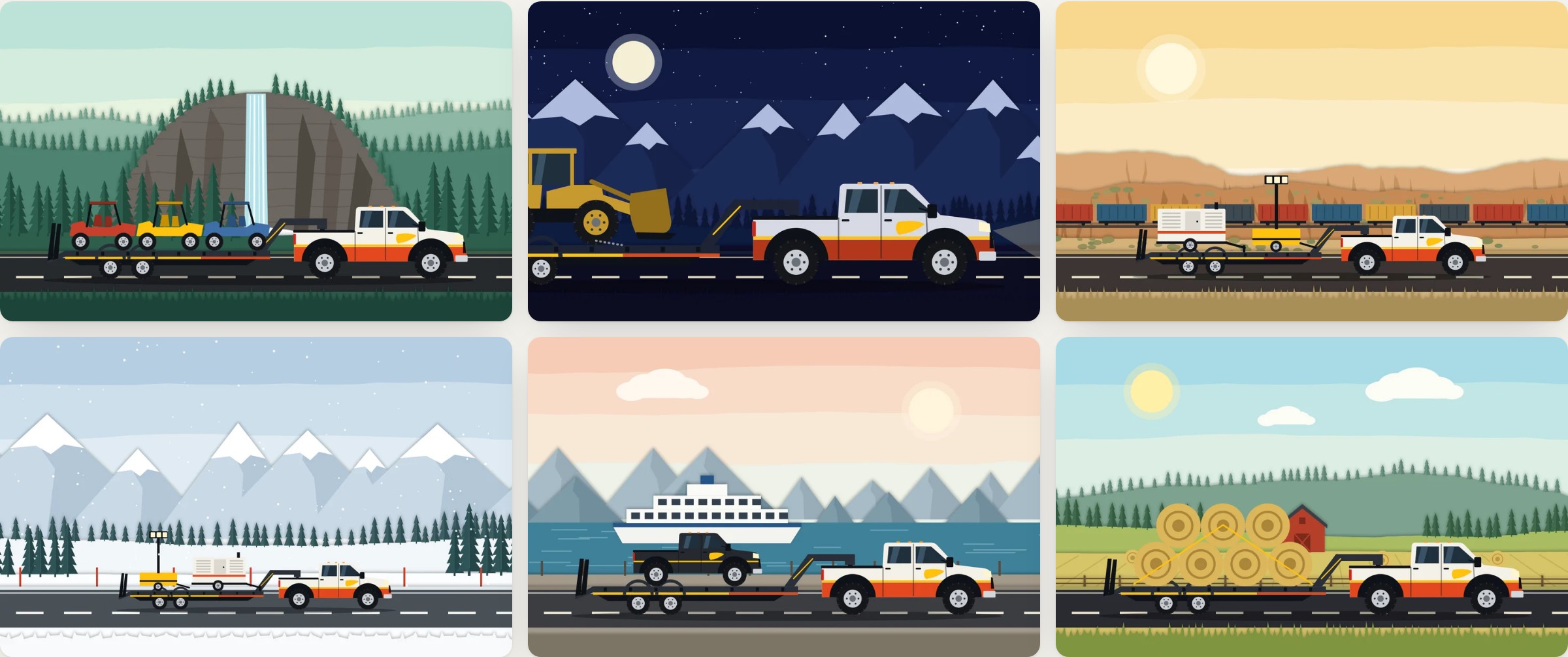
A real company would swap these for its own job photos: the upload tools are already in the admin, and the same picture slots take either one.
The opening shot
The homepage opens on a multiplane shot, the same trick as a multiplane camera: six layers of cut paper, each sliding at its own speed. The mountains barely creep along while the grass whips past, and that difference is what makes a flat picture feel deep.
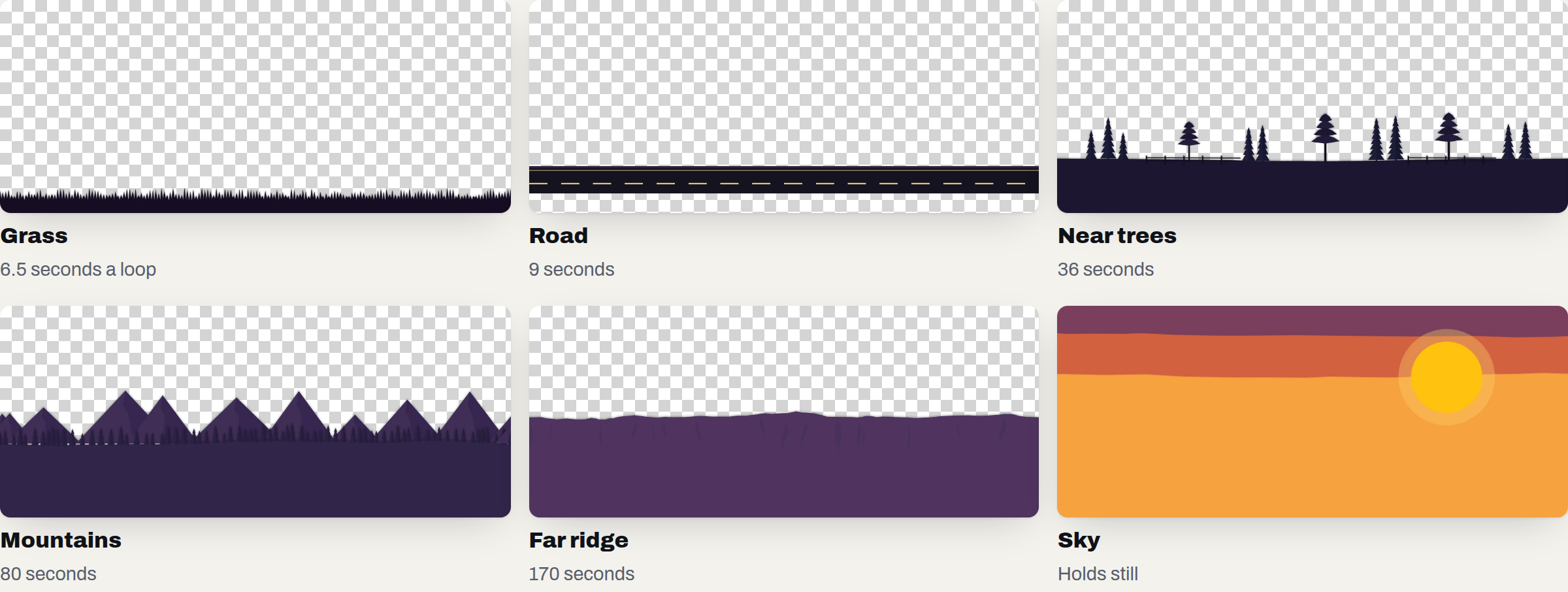
- Seamless loops. Each strip is painted so its right edge meets its left, like a pan background, so there’s never a visible join.
- Wheels that match the road. They turn at the speed the road slides past, so nothing looks like it’s skidding. Trailer wheels are smaller, so they spin faster.
- A little life. Truck and trailer bob on their own timing, and dust puffs drift off the back.
- Good manners. It pauses when it scrolls out of view, and it holds still for anyone who’s asked their phone to reduce motion.
Built to be found
SEO (search engine optimization) is what decides where a website shows up on Google. For a local hauler, it’s the whole game, so the site is structured around the words people actually type in each town: 56 pages, each with its own Google title and description, including 38 town pages with the real route, distance and drive time.
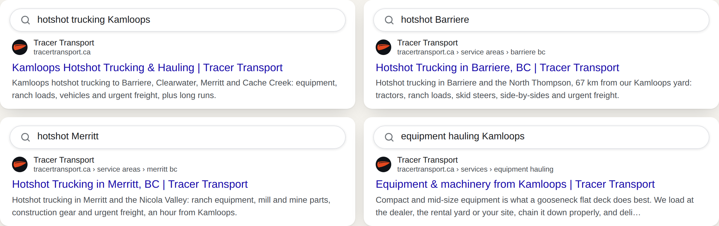
- No copy-and-paste towns. Each of the 5 home-turf towns has its own write-up, the communities around it, and questions only that town would ask.
- Every title fits. 56 titles, no two the same, all 60 characters or less, so Google shows them in full.
- Details Google can read. Structured data on every page gives the business, its services, its towns and the page trail.
- A sitemap that keeps itself current. Add a town in the admin and it’s listed automatically.
- Pictures described. Images that carry information have a description, and new job photos get one written from their town.
This site is hidden from search engines on purpose, because a fictional company shouldn’t compete with real ones. So I can show you how it’s built, but not rankings.
The website
Homepage
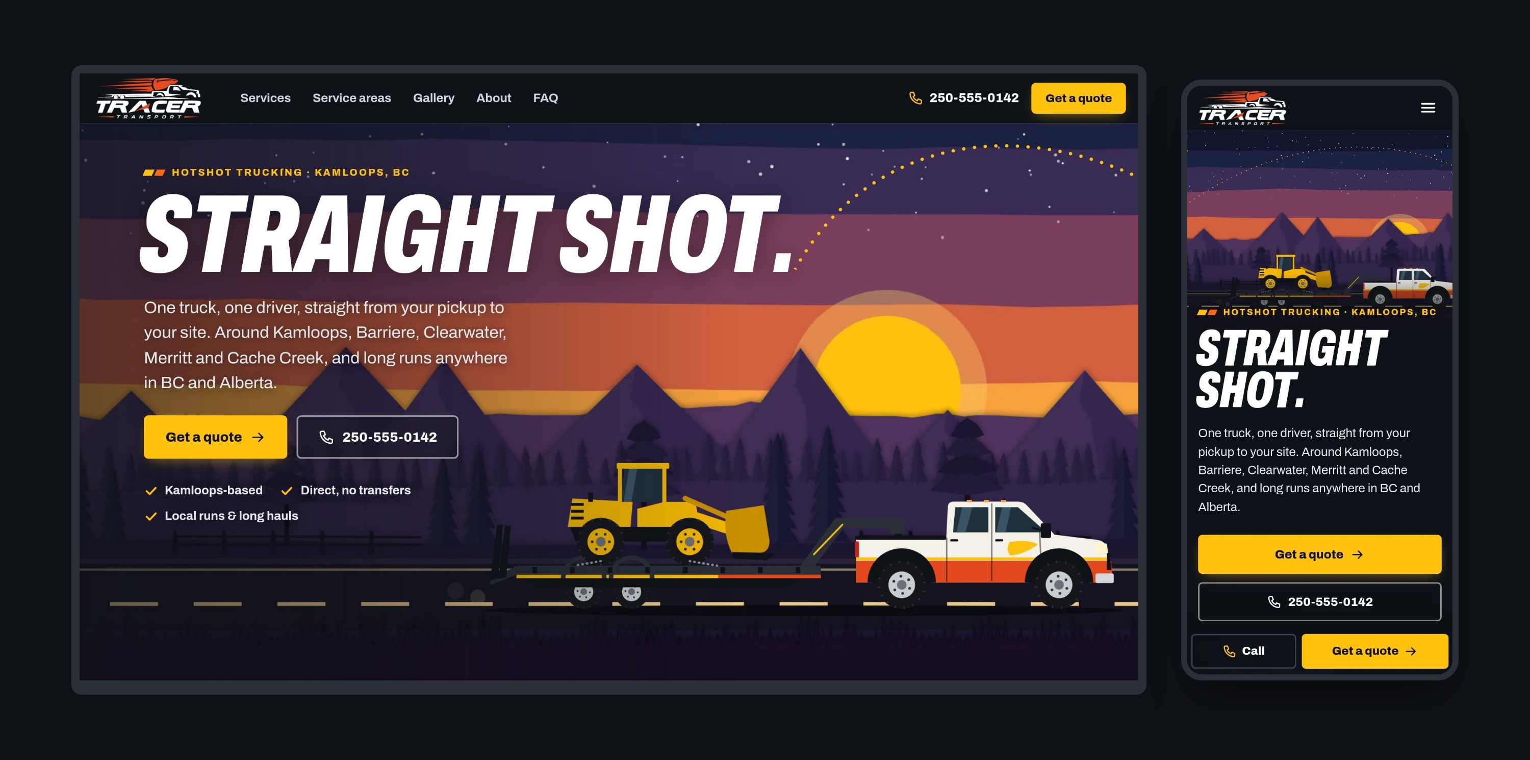
A phone number and a quote button are never more than a thumb away: on phones, a Call / Get a quote bar sits at the bottom of every page. Then a ten-second explanation of what a hotshot even is, what the company hauls, the map, and the rig.
The map
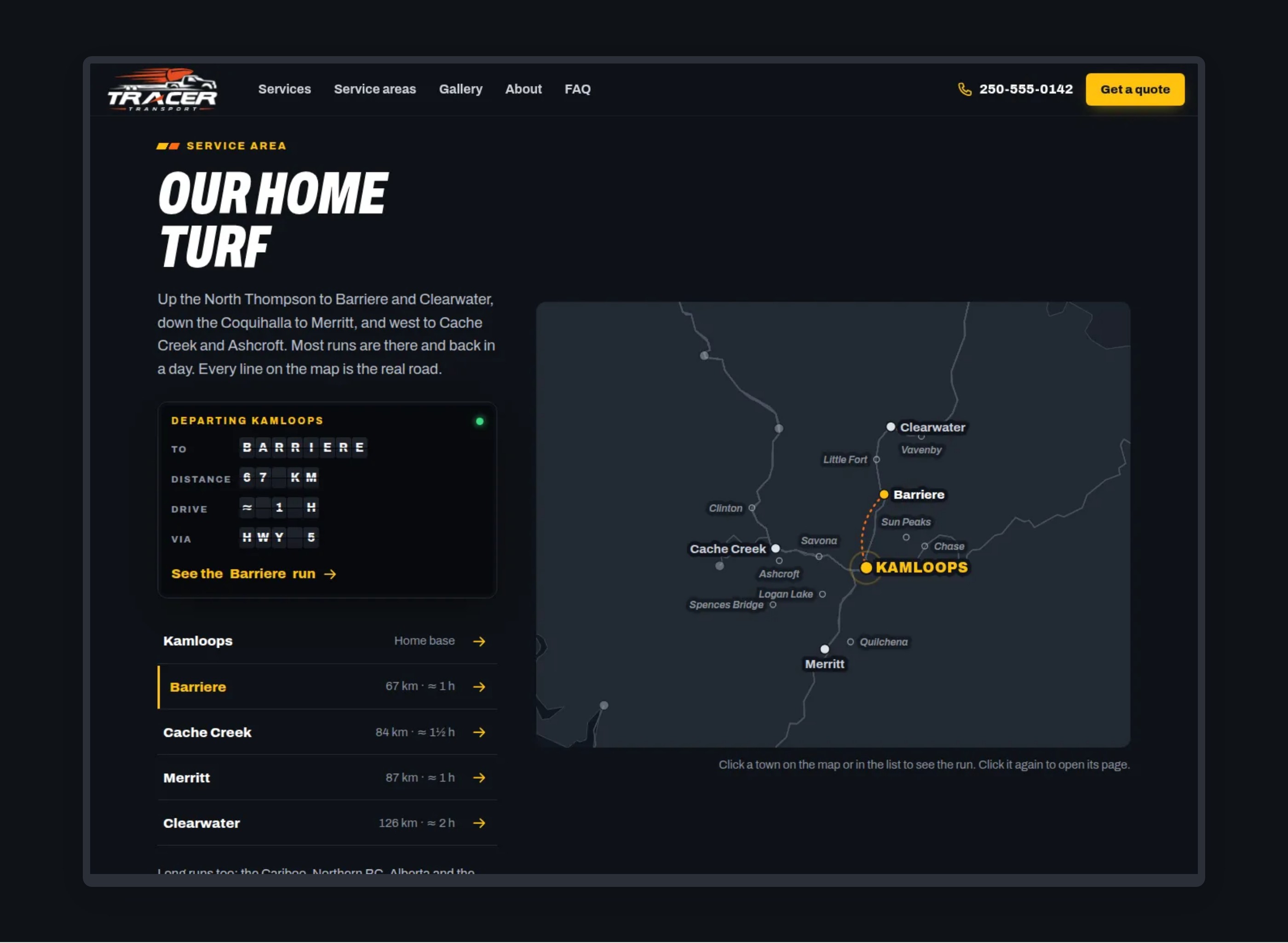
Every line is the real road from Kamloops, worked out from OpenStreetMap data. Pick a town on the map or in the list, and its route lights up while a split-flap departures board flips to the distance, drive time and highways.
Town pages
The route on a map, distance and drive time, what gets hauled there, the communities around it, and local questions. Long runs get their own pages too, from Prince George to Calgary.
Get a quote
It asks what a dispatcher needs to price a run: what it is, weight and size, pickup and drop-off, when, and how it loads. Arriving from a town page, the drop-off is already filled in.
Running it without a developer
The admin is the dispatch office. The team signs in and changes the website themselves, and every change is listed with the name of whoever made it.
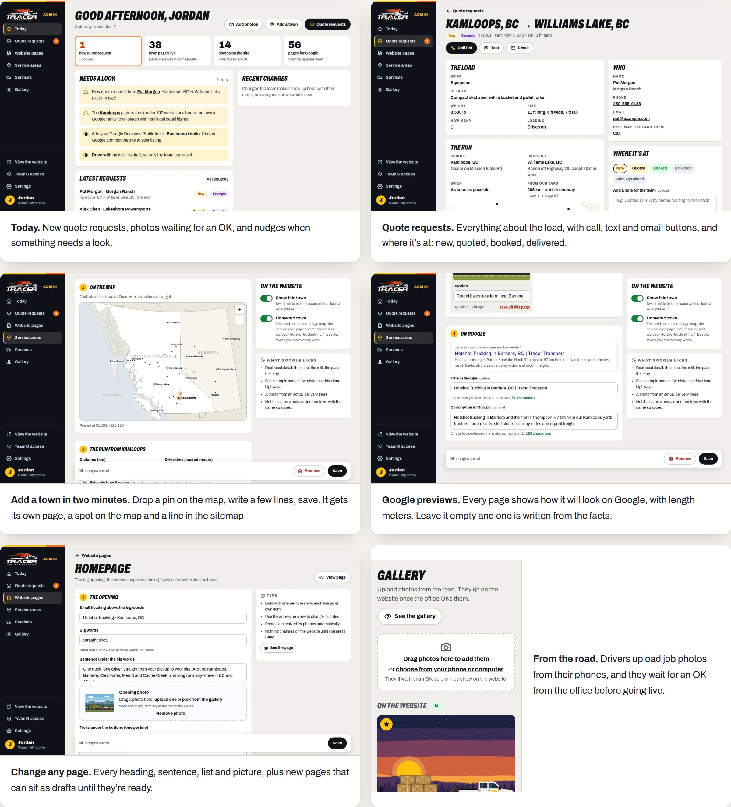
- Today. New quote requests, photos waiting for an OK, and nudges when something needs a look.
- Quote requests. Everything about the load, with call, text and email buttons, and where it’s at: new, quoted, booked, delivered.
- Add a town in two minutes. Drop a pin on the map, write a few lines, save. It gets its own page, a spot on the map and a line in the sitemap.
- Google previews. Every page shows how it will look on Google, with length meters. Leave it empty and one is written from the facts.
- Change any page. Every heading, sentence, list and picture, plus new pages that can sit as drafts until they’re ready.
- From the road. Drivers upload job photos from their phones, and they wait for an OK from the office before going live.
Who can do what: owners do everything. Managers work in the sections the owner ticks for them. Dispatchers handle quote requests and OK photos. Drivers upload photos only. Anyone can be paused, like a seasonal driver, without being removed.
Click around the admin. It’s a demo that opens signed in as the owner, and nothing saves.
Results
Google Lighthouse 12, simulated phone on 4G, November 2026. Each number is the middle of three runs. Accessibility, Best Practices and SEO* scored 100 on all six pages.
| Page | Speed | Main image appears | Downloads |
|---|---|---|---|
| Homepage | 92 | 2.6 s | 515 KB |
| Town page (Barriere) | 97 | 2.1 s | 274 KB |
| Service areas | 91 | 2.2 s | 402 KB |
| Gallery | 98 | 2.2 s | 502 KB |
| Get a quote | 99 | 2.0 s | 231 KB |
| Case study page | 98 | 2.3 s | 423 KB |
* With the one check that this concept fails on purpose (the lock that keeps it off Google) counted as passing.
Beyond the scores, I had a browser check every page at phone and laptop width for sideways scrolling, broken images and script errors, and walked the whole story from a customer’s quote to the owner’s inbox, adding a town and a page, and a driver’s photo waiting for an OK.
Refining it
I looked at every round the way I’d look at a pencil test, and sent notes back:
- The wiggle. Pictures that grew slightly on hover made the browser redraw their pixels, and they visibly shivered. Now hovers only change the light, like a layer’s opacity, and nothing moves.
- Rolling in as one. In the logo animation, the windshield arrived before the rest of the truck, because each piece moved by a percentage of its own size. Now all of it moves the same distance together.
- The dots. The trajectory first ran straight through the words. Now it fires from the full stop in “Straight shot.” and climbs clear of them.
- The truck door. The bullet decal first sat right on the door handle, and the paint ran through the wheel wells. The handles moved to the back edge of the doors, where they belong, and the wells went solid.
- The icon. The first version cropped the bullet. Now it always shows the whole thing, even at browser-tab size.
Tracer Transport is a fictional company made for this portfolio. Any resemblance to a real business is a coincidence. Routes from OpenStreetMap, map shapes from Natural Earth.